Adler Studio Website Redesign
- Category: Creative, Web, Interaction
- Tools: Figma, Jitter
- Year: 2025
This is a personal, unsolicited redesign of the Adler Design website, inspired by Deborah Adler’s iconic work, including her ClearRx prescription bottle. The project explores how her studio’s story, values, and design philosophy could be communicated through a modern, immersive digital experience. This case study is still a WIP (work-in-progress), with more sections and details to come.
Overview
I first discovered Deborah Adler’s work years ago through a Vox documentary that featured her ClearRx prescription bottle design. The clarity, intention, and impact of that project left a deep impression on me, that great design was not just about aesthetics, it was about solving real problems with empathy and precision. That inspiration stayed with me, and eventually led me to explore more of Adler’s portfolio.
Image of deborah adler from the Adler design website
Goals of the Project
While the current Adler Studio website offers a strong foundation, I saw an opportunity to experiment with how the founder’s story and design legacy could be communicated in a more modern and immersive way through refreshed visuals, reimagined storytelling, and smooth sleek interactions design to create an experience that reflects the clarity, craft, and humanity Deborah Adler’s work embodies.
Logo/Loading
Animation
Every great website should set the right tone from the very first moment. For Adler Design, I began by recreating the logo from scratch to ensure it had a clean, precise foundation. Once rebuilt, I animated it into a smooth loading interaction.The result is minimal but expressive, a small brand signature that could easily serve as a micro-interaction to greet visitors and set the tone for the entire experience.
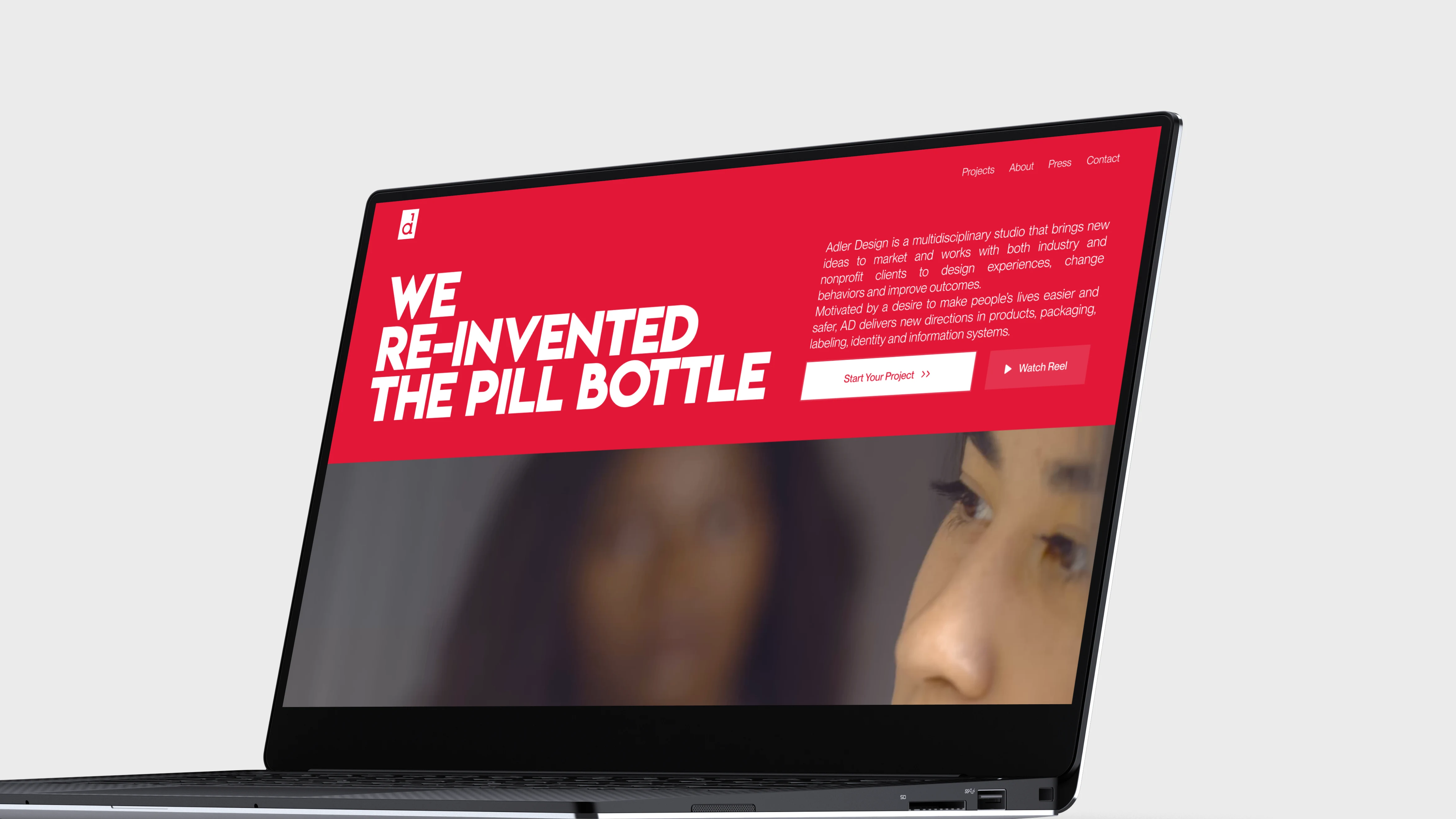
Redesigning the Hero Section
to Make a Strong First Impression
The original hero section was straightforward, but I wanted something more cinematic. The “Before” version of the hero section is included below for comparison. While it was functional, it lacked the impact needed for a strong first impression.
I redesigned the website to feel bold and immersive, pairing clean typography with a custom video reel. I crafted the reel myself using copyright-free footage to capture the clarity and intention that defines Adler’s design philosophy.
As users scroll, the content shifts away to give the design agency’s reel full focus. At this point, visitors are invited to play the reel directly, turning it into a more immersive “show, don’t tell” experience that communicates the agency’s value through real work rather than just words.
To make this possible, I assembled and edited the reel myself using freely sourced, copyright-free footage. This ensures the hero experience is not only visually engaging but also sets the right narrative tone for the rest of the site.
Elevating the “Our Approach” Section to
Communicate Design Philosophy
The original site already had an Our Approach section, but it was mostly just plain icons with titles. For the redesign, I wanted to make it more meaningful and engaging.
I kept the essence of the section but restructured it with stronger visuals, clearer content, and smooth animations in Figma. The goal was to better communicate the studio’s process while also creating a richer experience for users.
Crafting an Engaging “Our Story”
Section to Highlight Identity
As part of the redesign, I introduced a new Our Story section to the landing page. The idea was to give the site more personality and context by highlighting the studio’s background in a clear, visual way.
I focused on improving the layout and content, then added smooth text and image reveal animations in Figma to make the section feel more engaging as users scroll.
I also created a custom reel specifically for this section, sourcing and editing footage that aligns with the studio’s background. This provides visitors with a direct visual impression of the agency, complementing the written content.
The result is a section that communicates more clearly and gives users a stronger sense of the studio’s story.
This case study is still a work-in-progress, with more sections and details to come. It represents both an exploration of interaction design and a tribute to the clarity, empathy, and impact that define Deborah Adler’s body of work.
Follow along on LinkedIn for subsequent updates, or check back here later for the completed case study.
End of
Project
That’s all for this project. Keep scrolling to see the next one.

Plumter
- Category: Product, Enterprise, AI
- Year: 2022-2025
Designing and scaling the full product ecosystem of a global B2B fintech from the ground up.