Gobelins Paris Website Redesign
- Category: Creative, Web Design, 3D
- Tools: Figma, Spline, Jitter
- Year: 2025
I redesigned the GOBELINS Paris website as a personal project to modernize its look and improve usability while capturing the school’s world-class reputation in animation. I carefully reimagined every section of the old website, while also introducing fresh new ones. I combined Figma for UI and prototyping, Spline for 3D animations, and Jitter to create a seamless scroll-through experience. The full project file is also available for free below.
Download Figma File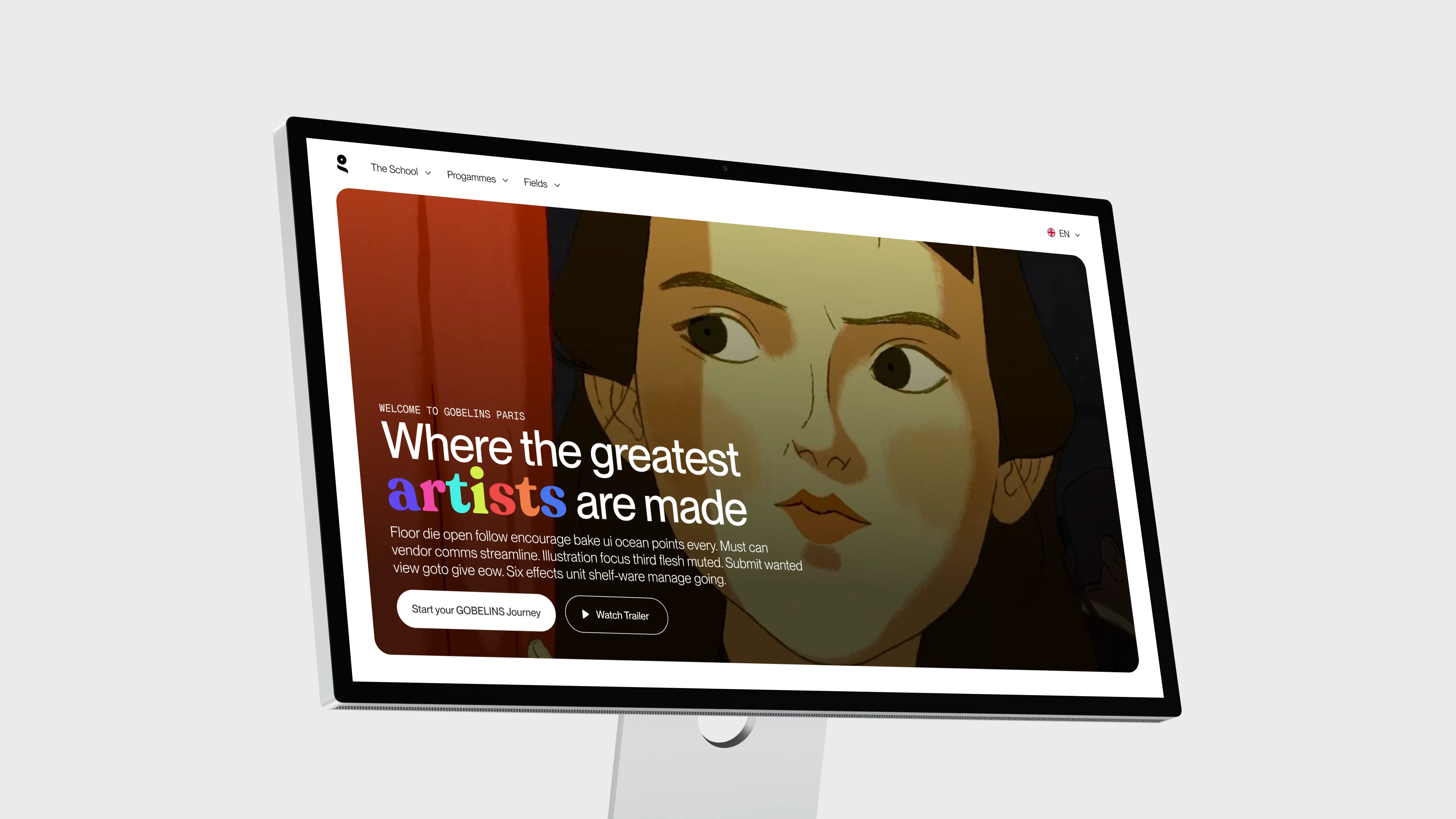
Overview
The GOBELINS Paris Website Redesign is a complete reimagining of the website for one of the world’s top animation schools. This project was born from a passion for creative expression and technical experimentation, aiming to deliver a modern, engaging, and user-friendly experience that captures the vibrant spirit of GOBELINS.
Goals of the Project
- Modernize the Design: Replace the dated look with a sleek, contemporary aesthetic.
- Enhance User Experience: Simplify navigation and reduce visual clutter to make key content more accessible.
- Celebrate Creativity: Infuse the design with dynamic animations and 3D elements that reflect GOBELINS' storied legacy in animation.
- Showcase Achievements: Develop dedicated sections that highlight the school's key metrics, success stories, and programs.
- Experiment with Tools: Seamlessly integrate Figma, Spline, and Jitter to push the boundaries of web design and interactivity.
Loading/Intro Sequence
& Hero Section
The objective of crafting a loading intro for the new website was to push creative boundaries with an immersive intro animation where the GOBELINS logo morphs from 2D to 3D and transitions into the site. While maybe not intended for final implementation, this experimental sequence allowed me to explore dynamic storytelling through animation.
The “Before” version of the hero section is included below for comparison. While it was functional, it lacked the impact needed for a strong first impression.
The new hero section was redesigned to feel more engaging, with bold visuals, clear calls-to-action, and background animations that add movement without being distracting. Together, these updates create a more polished and memorable introduction to the site.
Reel from the Gobelins website
About
Section
To give visitors immediate context, I introduced a brand-new About section. This concise intro provides a snapshot of what GOBELINS is about, its programs, reputation, and creative legacy, while maintaining a modern, streamlined aesthetic.
Featured illustration by Jordan andrew carter
Achievements
Section
The Achievements section highlights the school’s success metrics. At its center is a rotating glassy 3D GOBELINS logo, designed in Spline to resemble an award. The surrounding cards detail alumni successes, partnerships, and standout facts about the institution.
Programmes
Section
The Our Programmes area was redesigned with more appealing, modern cards, with extra emphasis placed on the degree programs card. The goal was to make program details both inviting and easy to navigate.
Alumni
Section
I added the Alumni section to celebrate GOBELINS graduates. Animated scrolling cards reveal notable animators and artists as users move through the section, creating a dynamic wall of talent that reflects the school’s heritage.
News & Updates
Section
The News & Updates section was redesigned to be cleaner and more modern, balancing text with imagery for a layout that feels fresh and easy to scan. Subtle animations add polish and help bring the content to life without overwhelming the user.
Events
Section
The Events page was reimagined with a minimalist, text-focused approach. Color-coded highlights show how much time is left before each event, improving usability and accessibility.
Contact Section &
Modal Integration
On the original site, the contact form sat exposed and cluttered. My redesign hides the form behind a modal triggered by a “Start Your Journey” button, keeping the section visually clean while still functional.
Footer
I concluded with a redesigned footer featuring a 3D background logo for visual interest and sleek UI animations that tie the site together. While the logo slightly competes with the text, I intentionally kept it for the cool factor in this personal project. In a real-world context, I would tone it down for clarity.
The Complete
Walkthrough
I’ve stitched everything together into a full walkthrough video that showcases the entire redesigned website from start to finish. Watch it with sound on to experience the animations and transitions fully.
Free Figma
Community File
The entire project, including UI, prototypes, and 3D assets, is available for free on the Figma Community. I’ve also included a “DUMP” page with all my scrapped ideas so you can peek behind the curtain at my process. Duplicate Figma File
End of
Project
That’s all for this project. Keep scrolling to see the next one.

Adler Design Studio
- Category: Creative, Interaction
- Year: 2024
Redesigning a global design studio’s website to balance clarity and creativity for the modern digital age